 >
>
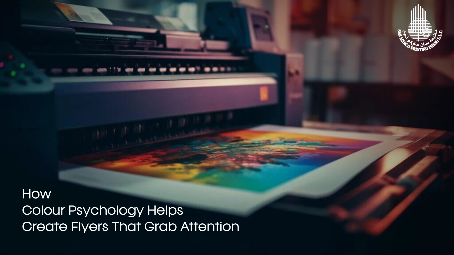
Color Psychology in Flyer Design: How to Attract Attention
Have You ever been wondering why certain flyers are so persuasive and others do not impress? It is all in the smart colour choice. The correct choice does not only capture the attention of the audience but also eliciting emotions, behavioural changes, and even increasing the conversion rates. In this blog, you will learn the psychology of each colour and how it can be used practically. Now, strap in because we are going to explore the intriguing world of colours, design tips in flyers, and how professional printing services in Dubai can make these ideas come to life with accuracy and impact.
What is Colour Theory?
Let’s pause for a moment before we explore colour psychology to understand colour theory. Do you know what colour theory is? It’s nothing but mixing different colours to make aesthetically appealing designs. Imagine mixing different ingredients to make a cake. Colour theory is similar, and the ingredients can be compared to colours.
It’s amazing to understand how various colours can invoke different emotions and reactions in people. Getting a sound knowledge of the subtle colour nuances helps you convey your business’s message with a clever use of colour.
Red: Energy and Urgency
Red is one of the most powerful colours, symbolising excitement, urgency, and strength. Its ability to grab attention instantly makes it a perfect choice for events that demand quick responses. Since the colour conveys a sense of urgency, it can be chosen if you’re planning for:
- Time-sensitive marketing or sales events
- Limited-time offers
- Flash discounts
- Promotional events
Blue: Trust and Professionalism
A calm and serene colour, blue conveys trust, stability, and professionalism. That’s why blue won as the top corporate branding colour. For promotional flyers printing, blue evokes feelings of reliability and security. Therefore, businesses in financial services, healthcare, and IT companies can adopt blue to foster trust in their potential customers. Blue is the best bet for:
- Financial services
- Healthcare services
- Technology and IT companies
- Corporate and professional services
- Education and training
Yellow: Optimism and Attention-grabbing
A vibrant and striking colour, yellow stands for energy, happiness, and optimism. As it’s easily noticeable, it’s ideal for colorful flyer printing that needs to be instantly compelling. A catchy, balanced flyer can be created by combining yellow and white/black. Yellow can be chosen if you’re planning for:
- Campaigns to increase brand awareness
- Event flyers
- Promotions and offers
Green: Calm and Growth
Green symbolises growth, health, and nature. It evokes feelings of new beginnings and eco-consciousness. As the colour fosters relaxation, making it ideal for flyers that promote wellness, sustainable items, or relaxation services. Green is the choice of:
- Health and wellness industry
- Organic products
- Financial growth and investment
- Events with a natural theme
- Flyers regarding eco-friendly products, fitness, or health
Orange: Creativity and Enthusiasm
Orange is a fresh, bold, and energetic colour that blends the intensity of red with the vibrance of yellow. It’s the perfect colour for brands looking to express their friendliness, creativity, and enthusiasm. As the colour sparks enthusiasm, it’s ideal for a range of flyers for entertainment, casual events, and creative businesses. Instances where you can use orange:
- Creative events
- Entertainment promotions
- Startups
- Launch of a new product
- Discount events
- Open houses
Purple: Creativity and Luxury
Purple represents royalty, creativity, and luxury. It communicates uniqueness and sophistication while exuding prestige and superior quality, thanks to its long association with royalty.
If you’re looking to promote your luxury products through Promotional flyers printing, then purple is the ideal pick. Instances where you can use purple:
- Luxury products or services
- High-end events
- Creative industries such as fashion or art
- Businesses that want to convey individuality
Exploring Colour Psychology
Now that you know the basics of colour theory and the connotations of each colour, we’ll dive deeper into how colours impact the way we behave and our emotions, as well as some flyer design tips. From vibrant orange to subtle green, every colour has a distinct emotional effect on the mind of the audience.
Prior to stepping into the realm of colour psychology, it’s amazing to know that various cultures connect colours with different meanings. For instance, in Western cultures, red is the colour of love. Whereas in South Africa, the same colour is the colour of mourning. This simple instance highlights how our emotions are strongly tied to colours.
How Colours Shape Emotions and Behaviours
Various colours can trigger different emotions and reactions in people. For instance, the colour yellow sparks optimism and energy. Yellow is commonly used by the food industry, including cafes, restaurants, and food delivery companies, as it stimulates appetite and encourages people to quickly take action. Business flyers can be crafted using yellow for the purpose of sales or promoting special offers.
When you have a sound knowledge of how colours have a psychological impact on people, it can be utilised strategically to impact the way people respond to your flyers. In addition, blending different colours together can be instrumental in evoking certain emotional responses. For instance, if you combine yellow and green, it will result in a more calming effect. Mixing and matching with different colours can introduce some depth and uniqueness to your design, which in turn improves the ultimate effect on your audience.
How to Pick the Right Colours for Your Promotional Flyers Printing
During flyer designing, picking the best colours based on your target audience is vital to fostering a connection and impacting their response. Fiery red or vibrant orange would work if you’re focusing on young adults or teenagers fascinated by fashion, tech products, or entertainment. Whereas, if your target audience is women, and you’re looking to promote women’s products or services, then choose soft pinks, pastels, or lavender colors. Keep in mind that the ultimate colour you pick is not just about your personal preference but also about how to communicate well with your target audience.
In addition, colour psychology is instrumental in brand identity and recognition. Regular incorporation of certain colours in your branding can foster a powerful visual connection with your business offerings.
How to Use Colour Theory for Promotional Flyers Printing
We hope you have benefitted from our flyer design tips. Next, we’ll apply the colour theory to craft attention-grabbing flyers. While exploring the flyer design world, it’s vital to understand the importance of colour psychology. The emotions and actions of the audience are driven by various colours, which makes it vital to choose colours that suit the expected message of the flyer. For example, colours such as green stand for growth and sustainability, whereas colours such as blue stand for trust and professionalism.
Crafting a Uniform Colour Scheme
A uniform colour scheme is essential for an aesthetically appealing flyer. In order to do that, pick colours that are near to each other on the colour wheel, like red and orange or magenta and violet. You can ensure the uniqueness and uniformity of your flyer with this simple method. But keep in mind that a well-coordinated colour scheme makes your flyer unique from that of your competitors.
Using Colour to Draw Attention to Key Information
A colour can be an effective instrument for directing the reader’s focus. Which means a visual hierarchy and highlighting important information can be done with the help of a striking colour for vital information such as CTA buttons or offers. For example, adding a touch of yellow to a block of blue design can grab the attention of your potential customers.
Importance of Neutral Colours in Flyer Designing
Muted shades like white, black, grey, beige, brown, ivory, cream, etc., are perceived as boring. However, they are instrumental in designing flyers. These muted shades offer a neutral background that allows other colours to take centre stage and help strike a balance in your design. So never overlook the potential of muted shades.
Through adhering to all these flyer design tips, be sure that you get a flyer that’s distinctive and effective.
Captivate Your Audience and Encourage Action With Our Flyers!
Leave your flyer design to San Marco Printing Press LLC. Printing services in Dubai is effortless with us. We will help make your flyers irresistible! Utilising the potential of colour psychology, San Marco crafts striking and impactful flyers that encourage them to take action, like buying your product or joining an event you’re hosting. No matter if you’re promoting an upcoming event such as a concert or sharing awareness about your business, the perfect colour selection can immensely increase your engagement and response rates. Want to enhance your flyers? Begin with our flyer design tips to leave an impact! Trust San Marco Printing Press and create a catchy flyer and notice the difference it makes in your marketing strategy.